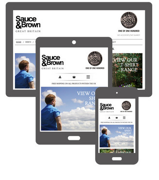
The need for businesses to have fully responsive websites is greater than ever, as Google has started to roll out its mobile-first indexing. Google’s mobile-first indexing will now be the primary focus for search, meaning that Google will be crawling mobile content first, rather than desktop material. 
Before this change, a separate mobile site was often considered a satisfactory way of making a website easy to read on a phone or tablet. However, this is no longer enough, as separate mobile sites typically have reduced content, making it harder for Google to find relevant material to answer search queries. As a result, the website ranking is negatively affected. 
 
Responsive websites solve the problem. Because a responsive website is one site that adapts to every screen size, the primary content is the same across mobile and desktop and therefore it is more likely that they will perform better in search results. 
 
Not sure if your website is fully responsive? Contact it'seeze Horsham today, and we will quickly be able to tell you if your site is responsive, or whether you have a separate mobile website. 
Tagged as: SEO, Website tips
Share this post:

Leave a comment: